
Wikipedia:Graphics Lab/Image workshop/Archive/Sep 2009
  | This page, part of the Graphics Lab Wikiproject, is an archive of requests for September 2009. Please do not edit the contents of this page. You can submit new requests here. |
Stale
Expansion of medieval Bosnia
Article(s): Bosnia and Herzegovina, History of Bosnia and Herzegovina, Tvrtko I of Bosnia...
Request: Hi. I noticed that File:Bosna.jpg is deleted on Commons. I found original, so, can someone create free equivalent of this map, please? We don't need COAs and galleons, only boundaries, temporary occupied territories (pink dots) and rivers. I can add important sites later, I hope.-- Bojan 05:04, 11 August 2009 (UTC)
Graphist opinion:
Resolved
Urdu alphabet / Devanagari
-
 Urdu Alphabet (grainy)
 -
 Test svg character
 -
 Final draft svg
 -
 Final version svg


Article(s): Urdu
Request: Could we make the Urdu script scale properly? SVG would be great, of course... but, a PNG where the Urdu script can scale to the proper size would be great. gren グレン 00:37, 11 May 2009 (UTC)
Graphist opinion(s): ![]() Request taken by Goldsztajn. Hi, a little complicated this request, but I've had a try and came up with the "be" character (although the Devanagari part is not quite correct yet). Nevertheless it's doable for me, I'll just be a little slow. Without the Devanagari phonetics it would be easier... :) Regards --Goldsztajn (talk) 10:08, 11 May 2009 (UTC)
Request taken by Goldsztajn. Hi, a little complicated this request, but I've had a try and came up with the "be" character (although the Devanagari part is not quite correct yet). Nevertheless it's doable for me, I'll just be a little slow. Without the Devanagari phonetics it would be easier... :) Regards --Goldsztajn (talk) 10:08, 11 May 2009 (UTC)
- Looks very good to me... and I see nothing wrong with the Devanagari (the loop closes in the PNG but not the SVG... but, that seems a matter of font and not of correctness). Thank you for working on this. I think it will be useful to have an SVG... unless you think it's better just to put this on the page in a table not using an image. But, Images are nice because you can print them out more easily. gren グレン 10:25, 11 May 2009 (UTC)
- It was ok, but not perfect as the accent on the Devanagari character was not displaying in the proper place, but with this second test file I seem to have solved that and now have all the Urdu/Hindi characters and accents displaying properly...just need to get English correct! --Goldsztajn (talk) 00:50, 12 May 2009 (UTC)
- First line completed, with diacritics and correct English.--Goldsztajn (talk) 09:30, 13 May 2009 (UTC)
- Second line completed, but a few problems with Hindi phonetics line...slowly, but surely... --Goldsztajn (talk) 04:25, 18 May 2009 (UTC)
- It's looking good. Obviously a lot crisper than it was. The thing and I may be able to figure this out by changing the font is to make it a more Nastaʿlīq looking script where it goes from upper right to lower left rather than the more typically Arabic naksh. But that's a matter of style. But, the Devanagari was definitely the most difficult part for me so thank you very much for that part. gren グレン 15:11, 24 May 2009 (UTC)
- Second line completed, but a few problems with Hindi phonetics line...slowly, but surely... --Goldsztajn (talk) 04:25, 18 May 2009 (UTC)
- First line completed, with diacritics and correct English.--Goldsztajn (talk) 09:30, 13 May 2009 (UTC)
- It was ok, but not perfect as the accent on the Devanagari character was not displaying in the proper place, but with this second test file I seem to have solved that and now have all the Urdu/Hindi characters and accents displaying properly...just need to get English correct! --Goldsztajn (talk) 00:50, 12 May 2009 (UTC)
- Looks very good to me... and I see nothing wrong with the Devanagari (the loop closes in the PNG but not the SVG... but, that seems a matter of font and not of correctness). Thank you for working on this. I think it will be useful to have an SVG... unless you think it's better just to put this on the page in a table not using an image. But, Images are nice because you can print them out more easily. gren グレン 10:25, 11 May 2009 (UTC)
I just wanted to revive this to see if someone can finish the SVG that has been started? gren グレン 19:32, 20 August 2009 (UTC)
- Sorry, this fell by the wayside, give me the weekend and hope to have it completed. Regards --Goldsztajn (talk) 23:50, 20 August 2009 (UTC)
- There's a final draft version. --Goldsztajn (talk) 07:44, 21 August 2009 (UTC)
Furnace Stack Damper Diagram
-
 Hand-drawn sketch
 -
 Vectorized


Article(s): Furnace
Request: Please vectorize. Connormah (talk) 22:37, 22 August 2009 (UTC)
Graphist opinion(s):
![]() Request taken by Hydrox. How is this? hydrox (talk) 17:44, 25 August 2009 (UTC)
Request taken by Hydrox. How is this? hydrox (talk) 17:44, 25 August 2009 (UTC)
Nanking Massacre
-
 rotate just slightly to trim off border remnants
 -
 trim off small German computer text at bottom
 -
 trim off unwikilike bordering


Article(s): Nanking Massacre
Request: minor wikifications to each... Chris (クリス • フィッチュ) (talk) 09:03, 23 August 2009 (UTC)
Graphist opinion:I am not sure, we are allowed to trim the German text of the middle image. That image was provided by the German Federal Archive and my understanding is that have to use the picture as is. Please correct me if I am wrong. SPLETTE :] How's my driving? 17:59, 23 August 2009 (UTC)
- They licensed it under Creative Commons Attribution ShareAlike 3.0, so there is no reason why we couldn't create another version that is edited with that text removed, so long as you attribute it back to the original. — raeky (talk | edits) 18:02, 23 August 2009 (UTC)
- First, the tag says For documentary purposes the German Federal Archive often retained the original image captions, which may be erroneous, biased, obsolete or politically extreme. Factual corrections and alternative descriptions are encouraged separately from the original description. That says to me they encourage us to fix it. Second, they provided the image to Wikipedia without condition, or the tags would read differently. Third, the information is just archival numbers, like an ISBN or a bar code, lets researchers know where they can find the image. Since the exact same info is reproduced both in the description page of the image, as well as the image name itself, I say run with it. Chris (クリス • フィッチュ) (talk) 18:07, 23 August 2009 (UTC)
- Okay okay okay. I cropped it. SPLETTE :] How's my driving? 18:10, 23 August 2009 (UTC)
- First, the tag says For documentary purposes the German Federal Archive often retained the original image captions, which may be erroneous, biased, obsolete or politically extreme. Factual corrections and alternative descriptions are encouraged separately from the original description. That says to me they encourage us to fix it. Second, they provided the image to Wikipedia without condition, or the tags would read differently. Third, the information is just archival numbers, like an ISBN or a bar code, lets researchers know where they can find the image. Since the exact same info is reproduced both in the description page of the image, as well as the image name itself, I say run with it. Chris (クリス • フィッチュ) (talk) 18:07, 23 August 2009 (UTC)
- Fast and friendly, great, thanks! Chris (クリス • フィッチュ) (talk) 18:13, 23 August 2009 (UTC)
- No worries :-) SPLETTE :] How's my driving? 18:21, 23 August 2009 (UTC)
Removing Done tag, since none of the modifications was done, the uploaded new versions appear identical. — raeky (talk | edits) 22:47, 23 August 2009 (UTC)
- I am not sure what you are talking about. Firstly, when just cropping an image or doing minor changes likes the ones done here, it is not encouraged to upload them under another name. Secondly, please have a closer look. All the modifications were done. The new (mostly cropped) versions of the images that I uploaded are not identical with the initial ones. Finally, I haven't removed any tags as far as I am aware of. SPLETTE :] How's my driving? 01:34, 24 August 2009 (UTC)
- My mistake on them not being done, apparently my browser didn't want to refresh the new images and I was seeing cached ones, what I meant was you cropped the original archive image for File:Bundesarchiv Bild 183-U1002-502, Japanisch-Chinesischer Krieg.jpg, you're modifying it by removing the tags on the bottom that the archive put there. It would be more appropriate to make a second image and link the two, then just replace the original with the one missing the archive's tags. — raeky (talk | edits) 02:00, 24 August 2009 (UTC)
- Hmm, I see what you mean. Might be the better practise, not sure. I mean, is this creative common picture to be treated different than any other creative common picture? Because in the history you can always find the original version, right? Anyway, feel free to revert my edit and upload it under another name. SPLETTE :] How's my driving? 02:07, 24 August 2009 (UTC)
- My mistake on them not being done, apparently my browser didn't want to refresh the new images and I was seeing cached ones, what I meant was you cropped the original archive image for File:Bundesarchiv Bild 183-U1002-502, Japanisch-Chinesischer Krieg.jpg, you're modifying it by removing the tags on the bottom that the archive put there. It would be more appropriate to make a second image and link the two, then just replace the original with the one missing the archive's tags. — raeky (talk | edits) 02:00, 24 August 2009 (UTC)
- I am not sure what you are talking about. Firstly, when just cropping an image or doing minor changes likes the ones done here, it is not encouraged to upload them under another name. Secondly, please have a closer look. All the modifications were done. The new (mostly cropped) versions of the images that I uploaded are not identical with the initial ones. Finally, I haven't removed any tags as far as I am aware of. SPLETTE :] How's my driving? 01:34, 24 August 2009 (UTC)
Nuvola Icon

Article(s): Many templates.
Request: Vectorize, please. Connormah (talk) 23:11, 28 August 2009 (UTC)
Graphist opinion(s): Already exists... SPLETTE :] How's my driving? 23:19, 28 August 2009 (UTC)
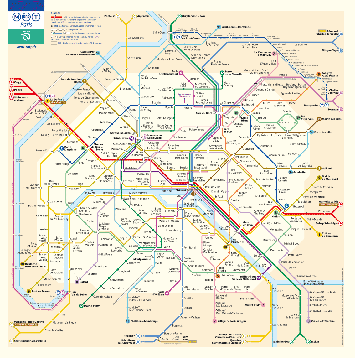
Paris Metro Images
-
 Paris Metro Sign
 -
 Paris Metro Logo

Article(s): Paris Métro, Comparison of rapid transit systems
Request: Can someone upload a better image of a Metro Sign than this (ex. not askew)?
It would also be nice to have a smaller logo/emblem for Paris Metro, comparable to ![]() ,
,  or
or  (perhaps something like [1] or [2] is such a logo)
Thanks! Sligocki (talk) 18:20, 20 August 2009 (UTC)
Graphist opinion(s):
Well, you can do that for a Wikiproject if you want but the official Paris Metro logo is far simpler. Look at the upper left hand corner of this map or on this ticket and you will see the logo for Metro is M with a circle, Trams are T with a circle, etc... gren グレン 19:34, 20 August 2009 (UTC)
- I traced that design to a SVG. BTW I just realized how many similiar-looking metro/commuter rail logos there are in the world, e.g.
 vs.
vs.  ,
,  vs.
vs.  , and
, and  vs.
vs.  (Boston vs. Stockholm, Copenhagen vs. Hamburg, Vienna vs. Berlin). hydrox (talk) 09:38, 21 August 2009 (UTC)
- Thanks hydrox! I agree, the logo of a letter with a geometric shape around it is not very unique, for the Comparison of rapid transit systems article I'm working on it might be nice to have some other more city-specific logos, but it's hard to know what if anything that might be. By the way, how do you make the SVGs? Do you know any software for Linux that could do it? Thanks, Sligocki (talk) 16:47, 21 August 2009 (UTC)
- Definetly. InkScape is an excellent open-source software for making SVG vector graphics, and most SVG you see on Wikipedia has been created with it (or Adobe Illustrator, which is proprietary Win/Mac software). It should be available on most distributions with apt-get install inkscape etc. (This one, however, I made only with a with text editor like a HTML file, by following the SVG spec. Writing the code by hand results in a smaller file size, although the difference is usually negligible.) hydrox (talk) 03:14, 22 August 2009 (UTC)
- Thanks hydrox! I agree, the logo of a letter with a geometric shape around it is not very unique, for the Comparison of rapid transit systems article I'm working on it might be nice to have some other more city-specific logos, but it's hard to know what if anything that might be. By the way, how do you make the SVGs? Do you know any software for Linux that could do it? Thanks, Sligocki (talk) 16:47, 21 August 2009 (UTC)
I hate to point it out, but the metro sign should be fair use since there isn't freedom of panorama in France, so photos of signs etc. on public display are subject to the same copyright as the sign itself. Time3000 (talk) 11:29, 21 August 2009 (UTC)
- Uhmm, I read that page and it appears that it is about photos which represent copyrighted artistic works (sculptures, architectual buildings) in public space. But we are arguing here, with the template {{PD-textlogo}}, that because the sign only consists of simple geometric shapes and text, it does not meet the threshold of originality, and is therefore uncopyrightable in the first place (at least under the U.S. jurisdiction). hydrox (talk) 13:17, 21 August 2009 (UTC)
Duplicate, logo already on commons for a long time: File:Metro-M.svg. Please check commons categories before asking for something that already exists. - Gonioul (talk) 21:57, 21 August 2009 (UTC)
- Sorry about that guys. I still wonder if this is the most recognizable symbol of the Paris Metro, does anyone know of a better image to use for it that would distinguish it from other cities' metros? I think that the metro signs are very recognizably Parisian, is there an example of these signs that could be a de facto logo? Cheers, Sligocki (talk) 23:56, 23 August 2009 (UTC)
- There's a lot of different metro signs, see fr:Aménagement des stations du métro de Paris#Les mâts. The (M) is I think the best symbol... - Gonioul (talk) 12:38, 24 August 2009 (UTC)
Old Icelandic Coat of Arms
-
 Old
Old -
 New
New


Article(s): Coat of Arms of Iceland
Request: This image looks like it was drawn in Paint...can it be SVG'd? Connormah (talk) 22:21, 20 June 2009 (UTC)
Graphist opinion(s):
![]() Request taken by Irunongames.
SVG'd it. Is it good?Irunongames • play 00:20, 22 June 2009 (UTC)
Request taken by Irunongames.
SVG'd it. Is it good?Irunongames • play 00:20, 22 June 2009 (UTC)
- No offense intended, but it does not look good at all, it looks autotraced. Can it be done properly? (eg. trace it manually)? Connormah (talk) 02:10, 22 June 2009 (UTC)
- Ok. When I get back from school I will mak e anew version using your suggestions :) Irunongames • play 10:27, 22 June 2009 (UTC)
- No offense intended, but it does not look good at all, it looks autotraced. Can it be done properly? (eg. trace it manually)? Connormah (talk) 02:10, 22 June 2009 (UTC)
Request for improvement: Pat Nixon Signature.svg
-
 Raster
 -
 Inkscape vector
 -
 Manual vector
Article(s): Pat Nixon
Request: The vector has some differences from the raster, you can find them at Talk:Pat Nixon. Can somebody please improve the vector image to look more alike the raster? Thank you. Connormah (talk) 18:13, 10 August 2009 (UTC) Here are the differences, listed at the talk page:
:From a far glance, yeah, perhaps the two look similar, but when one examines the vector image closer, significant errors made while attempting to trace the image can easily be found. The curve is not correct on the P; the a goes too far down; the N looks like an M, as the line goes down in the vector image for the i, while it goes up in the original (third curve in); the curve isn't as high as the original on the x; the o isn't a complete circle. The fact that the vector image, when examined looks different from the raster original image is what bothers me. If you can create an exact copy of the first image in SVG format, I will wholeheartedly support adding it in. But the vector image above has too many flaws.
— Happyme22
--Connormah (talk) 21:03, 10 August 2009 (UTC)
Graphist opinion(s): The low resolution (2K) raster barely contains enough information to reconstruct the signature but is this an improvement? The stroke is a bit thick but otherwise I think it follows the original reasonably well. This is an automatic trace in Inkscape with threshhold 0.8 and other parameters left as defaults. It's also much smaller, though larger than the jpg. Certes (talk) 01:19, 17 August 2009 (UTC)
- It is an improvement. It is small, but I suppose that is because the original was so small. Happyme22 (talk) 06:39, 21 August 2009 (UTC)
Can we reach a consensus on which image to use? See also the discussion at User talk:Happyme22#Pat Nixon Signature. Certes (talk) 21:33, 25 August 2009 (UTC)
Centre version above traced in Inkscape with threshold=0.77 per consensus. This has appeared in the article immediately, so perhaps we can mark this request as resolved. Certes (talk) 11:37, 31 August 2009 (UTC)
Map on Christianity article
Please read my post here. Someone with an image editor can handle this request. Thanks, AnupamTalk 23:50, 18 August 2009 (UTC)
SVG text again
— Thanx 76.117.247.55 (talk) 19:06, 31 August 2009 (UTC)
-

-
 initial draft (english)


Articels: Ones dealing with power in Europe and the Soviet Union
Request: Fix the text in the legend box, or remove it to the image description page. Also, Denmark should be striped the way Iceland is, Cyprus should be added and the Baltic states should be a different color (BALTSO). 76.117.247.55 (talk) 03:20, 19 August 2009 (UTC)
Opinion:![]() Request taken by Goldsztajn.. Need some clarifications. On the NORDEL page it says that eastern Denmark is part of NORDEL are you saying to change the Eastern Part? or should the Western part be striped like Iceland. If Cyprus is added, does it need a colour? I've done a basic draft in English.--Goldsztajn (talk) 08:13, 21 August 2009 (UTC)
Request taken by Goldsztajn.. Need some clarifications. On the NORDEL page it says that eastern Denmark is part of NORDEL are you saying to change the Eastern Part? or should the Western part be striped like Iceland. If Cyprus is added, does it need a colour? I've done a basic draft in English.--Goldsztajn (talk) 08:13, 21 August 2009 (UTC)
- OK, I didn't know that about .dk, it can be left alone. Cyprus (and Malta and Iceland) have separate island grids, but I don't know the details about them. I would justa dd Cyprus and Malta and leave them colorless for now. 76.117.247.55 (talk) 20:37, 21 August 2009 (UTC)
- Umm...checking up on this a little more, most of these orgs don't exist anymore...they've all been merged...seems like this is the map that would be needed once someone gets round to creating the appropriate article.... --Goldsztajn (talk) 07:20, 23 August 2009 (UTC)
- That is one ugly map. 76.117.247.55 (talk) 17:39, 23 August 2009 (UTC)
Note: My remark above referred to the map that User:Goldsztajn linked to, not the map I requested. 76.117.247.55 (talk) 21:16, 28 August 2009 (UTC)
'Speedwriting' quick vectorizing job
-
 Speedwriting sample text
 -
 SVG
SVG
Article(s): Speedwriting
Request: Simple vectorizing; I'd do it if I had my computer with me. James1293 (talk) 19:03, 21 August 2009 (UTC)
Graphist opinion(s):
![]() Request taken by Splette.: Does it have to be exactly the same font? Rather than vectorize this low-res pic, I'd suggest to simply redo it. SPLETTE :] How's my driving? 19:08, 21 August 2009 (UTC)
Request taken by Splette.: Does it have to be exactly the same font? Rather than vectorize this low-res pic, I'd suggest to simply redo it. SPLETTE :] How's my driving? 19:08, 21 August 2009 (UTC)
- Why not just use your keyboard? ZooFari 05:06, 22 August 2009 (UTC)
- That is exactly what I meant. But I don't know what font he used or if the font is any important to him. SPLETTE :] How's my driving? 05:51, 22 August 2009 (UTC)
- According to the article, Speedwriting uses a typewriter or "a stylized script made in 1942". Unless we can find that script, I suggest a typewriter font like the .png. Certes (talk) 10:48, 22 August 2009 (UTC)
- I don't have such a font. Could someone else please take care of this one? Btw, the original uploader may be able to provide a svg version. Thanks SPLETTE :] How's my driving? 18:22, 23 August 2009 (UTC)
- According to the article, Speedwriting uses a typewriter or "a stylized script made in 1942". Unless we can find that script, I suggest a typewriter font like the .png. Certes (talk) 10:48, 22 August 2009 (UTC)
- That is exactly what I meant. But I don't know what font he used or if the font is any important to him. SPLETTE :] How's my driving? 05:51, 22 August 2009 (UTC)
File:Storm with developing storm.jpg
-
 A severe thunderstorm (left) with a developing storm to the right. Cloud striations can be seen in the developing storm.
Article(s): None attm, waiting for fixes first.
Request: This panorama I made seems to be one of the worst. If anyone who knows more about fixing images than I am could work it over (perhaps to FP status, if that is even possible), then I would be deeply thankful to them. I can provide the images used to make the panorama if requested. Ks0stm (T•C) 16:16, 29 August 2009 (UTC)
Graphist opinion(s):
![]() Request taken by Mononomic..
Request taken by Mononomic..
I can't promise you FP status, but I'll be more than happy to clean up that panorama. Could you provide me with the source images? Mononomic (talk) 22:19, 30 August 2009 (UTC)
- Sure...how would you like me to get them to you? Upload, or email? Ks0stm (T•C) 22:38, 30 August 2009 (UTC)
- I've sent you an email. You can attach the pictures and reply. Mononomic (talk) 22:41, 30 August 2009 (UTC)
- Email sent, pictures attached. Ks0stm (T•C) 22:47, 30 August 2009 (UTC)
- Done, reuploaded under original image. You may have to SHIFT+Refresh to see the new version if your browser keeps an image cache. Any thoughts? Mononomic (talk) 00:10, 31 August 2009 (UTC)
- It looks good, did you get my second email with the additional pictures of the overexposed area? Ks0stm (T•C) 00:38, 31 August 2009 (UTC)
- Done, reuploaded under original image. You may have to SHIFT+Refresh to see the new version if your browser keeps an image cache. Any thoughts? Mononomic (talk) 00:10, 31 August 2009 (UTC)
- Email sent, pictures attached. Ks0stm (T•C) 22:47, 30 August 2009 (UTC)
- I've sent you an email. You can attach the pictures and reply. Mononomic (talk) 22:41, 30 August 2009 (UTC)
Vector flag with raster in it.
76.117.247.55 (talk) 19:05, 31 August 2009 (UTC)
-
 Note the Eagle on the left.
 -
 Vector of Eagle


Articels: Ones on Poland/Lithuanian history
Request: Replace the raster image of the eagle that's on the flag with the one in the coat of arms. 76.117.247.55 (talk) 03:33, 30 August 2009 (UTC)
Oppinion:
![]() Done. How's that? ZooFari 18:01, 30 August 2009 (UTC)
Done. How's that? ZooFari 18:01, 30 August 2009 (UTC)
Good. 76.117.247.55 (talk) 19:05, 31 August 2009 (UTC)
Dominican flag color correction
76.117.247.55 (talk) 23:05, 1 September 2009 (UTC)

Articels: Ones involving the Dominican Republic at sea.
Request: There is an annotation on the flag which displays where there is an incorrect color. That color should be the same blue as the rest of the flag. 76.117.247.55 (talk) 19:09, 31 August 2009 (UTC)
Oppinion:
![]() Fixed. ZooFari 22:39, 31 August 2009 (UTC)
Fixed. ZooFari 22:39, 31 August 2009 (UTC)
Flag of Pakistan
-
 The Flag Of Pakistan
 -
 Govt. of Pakistan


Article: User:Alipk007/National Youth Awards of Pakistan
Request: Kindly please just add the 2 images without any captions to the top right of the page. Thnx. Alipk007 18:22, 2 September 2009
Graphist opinion(s): I have added the existing images to the user space article. Is that what you meant (or close enough that you can finish the job yourself)? Certes (talk) 19:23, 2 September 2009 (UTC)
Lady Gaga
Article(s): Lady Gaga
Request: Add Information About Lady Gaga's Second Album Called "Disco Heaven"... Greg200 (talk) 06:48, 3 September 2009 (UTC)
Graphist opinion(s): Are there some images that you would like us to improve? If this is a request to add text to the article, it may be better to ask on the talk page or in one of the Wikiprojects listed there. Certes (talk) 11:09, 3 September 2009 (UTC)
Hillary Clinton
-
 Hillary Clinton
 -
 Denoised


Article(s): Hillary Clinton
Request: The article needs the background noise reduced so it can have a better chance at FP ... William S. Saturn (talk) 01:13, 18 June 2009 (UTC)
- I'm not letting this go stale until it's done. --William S. Saturn (talk) 19:03, 7 July 2009 (UTC)
Graphist opinion(s): Alright, I'll bite. From a photographer's standpoint, that image is composed quite well. The shot is in focus and the background is not distracting. Yea, the background is blurry, but that's hardly "noise" in my opinion. Was there a specific complaint? Only thing is it looks darker than the images in the rest of the article. Can you clarify exactly what you want done please? --BsayUSD [Talk]π[contribs] 23:34, 22 July 2009 (UTC)
- It was nominated as a FP, and suspended due to the high-noise in the background. It needs ran through something like noise ninja. — raeky (talk | edits) 04:50, 23 July 2009 (UTC)
- Anybody with a noise ninja? --William S. Saturn (talk) 21:02, 7 August 2009 (UTC)
I've de-noised a few pictures, but I strongly disagree with the opinion that the RGB noise in the background of this image is a problem. It looks for all the world like film grain! As Bsay USD said, it's well composed, and the background is nice and blurry, so it doesn't distract. Artificially reducing the noise with a filter is not a good idea here. I'd re-nominate, and ask a few wikigraphists to join the discussion. --Slashme (talk) 07:30, 9 August 2009 (UTC)
- Can somebody run it through and see if it looks any better? --William S. Saturn (talk) 02:00, 17 August 2009 (UTC)
![]() Request taken by raeky. I'll do it, finally got proper software to do this. — raeky (talk | edits) 18:00, 13 September 2009 (UTC)
Request taken by raeky. I'll do it, finally got proper software to do this. — raeky (talk | edits) 18:00, 13 September 2009 (UTC)
 Done Ok done, this tool does remove some of the finer detail of her face as well, but it got rid of the background noise. — raeky (talk | edits) 18:06, 13 September 2009 (UTC)
- I went ahead and made a proper mask over her face and hair due to the initial comments in the FP nomination, it should resolve those concerns now since no detail is lost in those areas due to the denoise filter anymore. The comment about there being too much noise, I have no idea what he's talking about it has MUUUCH less noise now than several of the other recent FP pictures that successfully was nominated. — raeky (talk | edits) 15:51, 15 September 2009 (UTC)
Translation of an image
-

-
 SVG by ZooFari


Article: Solid phase microextraction
Request: Image should be translated and if possible converted to SVG at the same time. --Leyo 08:01, 1 September 2009 (UTC)
Graphist opinion(s):
![]() Request taken by ZooFari.
Request taken by ZooFari.
![]() Done How's that? ZooFari 01:44, 4 September 2009 (UTC)
Done How's that? ZooFari 01:44, 4 September 2009 (UTC)
Kokang in Shan State
-
 Kokang (smaller - location within Shan State)
 -
 Shan State (bigger - location within Burma)
 -
 Combined image


Article(s): Kokang and Kokang incident
Request: Could someone put the first of these maps onto the second, to provide a map showing the location of Kokang relative to all of Burma (as opposed to just relative to Shan State, the province where it is located)? This should be fairly simple—shrinking the Kokang map to the right size and putting it on top of the other map, where the red part is right now—I just don't know enough Photoshop to do it right. Removing the internal borders (thin gray lines) on the big Shan map would also be nice; also, if it's easy to remove the Catalan text from the yellow Kokang map and leave it blank, that would be awesome, but if it's too time-consuming don't worry about it. rʨanaɢ talk/contribs 05:31, 3 September 2009 (UTC)
Graphist opinion: Is the third image above what you were looking for? This is an SVG, as the two PNGs were hard to combine directly, possibly due to using different map projections. Please ask if you want any text added or colours changed - these are very easy to do. Certes (talk) 23:15, 5 September 2009 (UTC)
- This looks great. For the purposes of making just a Kokang map, though, the darker-green portion to the left could be totally removed (turned yellow, and have its borders taken off), if that's not too difficult. rʨanaɢ talk/contribs 17:18, 16 September 2009 (UTC)
VIE
-
 This is a .png screen print of the word document.
 -
 New SVG.


Article(s): Vacuum Insulated Evaporator (This article is on my to-do list for clean-up and improvement)
Request: Would it be particuarly easy to convert this into a .svg file? I am rubbish at anything image related and created this picture in the new version of microsoft word, perhaps you can just copy the shapes from the .docx to inkscape? I don't know whether it is possible for me to upload .docx files to wikipedia, so I have uploaded it to my website here: http://home.captain-pot-noodle.com/stuff/VIE.docx. Thanks in advance and sorry for being completely useless ;-) Captain n00dle T/C 09:57, 4 September 2009 (UTC)
Graphist opinion(s): Yes, it's an ideal case for SVG. (And no, you're not rubbish or useless: that's a perfect specification of requirements.) Sadly I can't get anything apart from text out of the .docx using OpenOffice. Can someone with MS Word do better? Certes (talk) 22:04, 5 September 2009 (UTC)
- Vacuum_Insulated_Evaporator.svg — needs some tweaking, lost some gradients and subtleties in the conversions, and there's some raster data, too. ¦ Reisio (talk) 23:21, 5 September 2009 (UTC)
- Redrawing it in Inkscape is ideal. I will try doing it. --Jackl 16:08, 6 September 2009 (UTC)
- Thanks all! Reisio; I don't think that the image needs the text (except for the labels) as I can include this in the article, the text was in the word document because my mum needed me to create this picture for her. Captain n00dle T/C 19:39, 6 September 2009 (UTC) (p.s. I shall get the article done soon, my mum was the main source of information about it to get it started and she has disappeared somewhere for a few days)
- I just tried to convert it to an .odt so that Certes didn't feel left out, but sorry, it wasn't playing ball! Captain n00dle T/C 19:59, 6 September 2009 (UTC)
- Redrawing it in Inkscape is ideal. I will try doing it. --Jackl 16:08, 6 September 2009 (UTC)
- I am currently working on it. Just a quick question: Do you want the little rectangles below the pressure regulator to be merged into one polygon, or leave them separated? Many thanks. --Jackl 09:59, 7 September 2009 (UTC)
- First draft of the new SVG drawn and uploaded on Commons. --Jackl 12:35, 7 September 2009 (UTC)
- Good job! SPLETTE :] How's my driving? 22:11, 7 September 2009 (UTC)
- I will try to down-size it a bit. But for now, it's finished. --Jackl 09:12, 8 September 2009 (UTC)
- Wow that looks great! Thanks all! (and thanks for putting it on the commons too) I just need to do the article now :-/
- I will try to do it this evening. I even saw the equipment outside yesterday, so I shall take a photo of the real thing too.
- Please have a cookie (::) as a token of my appreciation ^_^ Captain n00dle T/C 16:34, 8 September 2009 (UTC)
- I will try to down-size it a bit. But for now, it's finished. --Jackl 09:12, 8 September 2009 (UTC)
- Good job! SPLETTE :] How's my driving? 22:11, 7 September 2009 (UTC)
- First draft of the new SVG drawn and uploaded on Commons. --Jackl 12:35, 7 September 2009 (UTC)
Sorry, silly question, but what do I do with the old one? It has become a child, and is a different file type so it doesn't appear as an 'old version'. Thanks in advance :-) Captain n00dle T/C 16:39, 8 September 2009 (UTC)
- I added a Vector Version Available template on the png. Also, please add {{Resolved|~~~~}} on top of the page if you are satisfied with the results. Thanks. --Jackl 01:35, 10 September 2009 (UTC)
.JPG)
Article(s): Cape Canaveral Light
Request: I was wondering if someone wouldn't mind brightening up the colours in this image, please? Many thanks in advance, Colds7ream (talk) 21:05, 5 September 2009 (UTC)
Graphist opinion(s): Attempted, by increasing saturation 100% in GIMP. The tower and ground look realistic but if that sky is just too bright, I can try again with a lower number. Certes (talk) 21:30, 5 September 2009 (UTC)
- I recommend the version now shown above, which includes further improvements by Reisio. Certes (talk) 11:05, 6 September 2009 (UTC)
- Thanks very much! :-) Colds7ream (talk) 14:48, 6 September 2009 (UTC)
The Stub-Class Barnstar
-
 Barnstar
 -
 How about the opposite of this (see below)?
 -
 raeky's version


Article(s): Template:Stub-Class Barnstar
Request: A Barnstar for my proposal of the stub-class barnstar mess with it anyway you like but please make it related to stub-class... BigPadresDude 23:56, 5 September 2009 (UTC)
Graphist opinion(s):
Why would one award a stub-class barnstar? If it's for humour then perhaps the image itself should be a basic and incomplete stub, e.g. ![]() ! Certes (talk) 11:09, 6 September 2009 (UTC)
! Certes (talk) 11:09, 6 September 2009 (UTC)
- Reply it would go to editors who go out of there way to improve stub-class articles BigPadresDude 00:23, 7 September 2009 (UTC)
- Ah, I see - that sounds like a much better idea and my mischievous suggestion is certainly not appropriate for such worthy work. Certes (talk) 20:40, 7 September 2009 (UTC)
- Perhaps we could use the opposite of the second picture above, with the graffiti replaced by a blank outline or rough sketch of part of a barnstar (analogous to a stub article) and the eraser replaced by the graphite end of the pencil (or a paintbrush) to indicate the process of completion. Certes (talk) 22:06, 7 September 2009 (UTC)
![]() Done: Theres my interpertation of Certes idea for a stub barnstar, like it? — raeky (talk | edits) 18:42, 13 September 2009 (UTC)
Done: Theres my interpertation of Certes idea for a stub barnstar, like it? — raeky (talk | edits) 18:42, 13 September 2009 (UTC)
WOW WOW THANK YOU i will boldley add my idea to the list of barnstars BigPadresDude 20:11, 13 September 2009 (UTC)
Coat of arms of Hong Kong under British rule
![]() Done
Done
Article(s): Coat of arms of Hong Kong
Request: reverse colors so background is not black-great for a t-shirt, bad for Wikipedia... Chris (クリス • フィッチュ) (talk) 17:42, 7 September 2009 (UTC)
Graphist opinion: Hows this? Fallschirmjäger 19:08, 7 September 2009 (UTC)
- That is perfect, can you upload it on top of the unencyclopedic black version? Chris (クリス • フィッチュ) (talk) 02:40, 8 September 2009 (UTC)
Particle collision diagram
The base image can be found here
Article(s): Top quark
Request: The layout is essentially OK, however there are some mistakes made (particularly concerning particles and antiparticles), and it would be nice to use symbols rather than words. If you keep the balls and arrows on that picture, the following changes would need to be made
- Above: Top quark = t, bottom quark = b, W+ boson = W+, muon = μ+, neutrino = νμ
- Middle: Protons = p, antiprotons = p. Keep the "explosion"-looking thingamajig.
- Below: Top quark = t, bottom quark = b, W− boson = W−, left quark = c, right quark = b. Ignore the "low-energy muon".
- Remove everything else (legend, caption, particle/antiparticle, ...)
- Please pay attention to italics, overlines, superscripts, and using real minus signs (−) rather than a hyphen (-)
- The arrows from the top quark/antiquark to W± should be replaced by squiggly lines (such as in here)
Headbomb {ταλκκοντριβς – WP Physics} 09:56, 11 September 2009 (UTC)
Graphist opinion(s):
![]() Request taken by raeky.: I'll take it. — raeky (talk | edits) 21:17, 13 September 2009 (UTC)
Request taken by raeky.: I'll take it. — raeky (talk | edits) 21:17, 13 September 2009 (UTC)

I'm sure I got something wrong, but I tried to follow your directions fairly well. Let me know what to change. — raeky (talk | edits) 01:33, 14 September 2009 (UTC)
- I swear I replied to this earlier. Anyway, here goes again. First it's a very good first draft, but yes, there are some more tweaks to be made before it's gold. Namely:
- All the b, t, W−, νμ, should have full circles
- All the c, b, t, W+, μ+ should have empty circles
- All the b and b should have the same base color (yellow)
- The green empty circle (and its arrow) at the bottom should be removed
- And that should be good enough. Headbomb {ταλκκοντριβς – WP Physics} 05:46, 14 September 2009 (UTC)
Gorintō

Article(s): Gorintō
Request: Create a simple graphic based on [3] marking the five parts of the pagoda. bamse (talk) 19:58, 11 September 2009 (UTC)
Graphist opinion(s):
![]() Request taken by raeky.: — raeky (talk | edits) 20:25, 13 September 2009 (UTC)
Request taken by raeky.: — raeky (talk | edits) 20:25, 13 September 2009 (UTC)
- Done: Let me know if I should change anything. — raeky (talk | edits) 20:38, 13 September 2009 (UTC)
Héraldique ornement Heaume baronnet

Article(s): Articles tagged with {{WPBiography|baronets-work-group=yes}}
Request: Quick and easy request: can someone please trim the blank space at the top and bottom of this icon? Thanks in advance! PC78 (talk) 23:17, 12 September 2009 (UTC)
Graphist opinion(s): Done. How's that? Certes (talk) 10:23, 13 September 2009 (UTC)
Fumiko Hayashi

Article(s): Fumiko Hayashi
Request: Trim sides down to encyclopedic... Chris (クリス • フィッチュ) (talk) 01:53, 13 September 2009 (UTC)
Graphist opinion: Cropped. Is that ok? (I purged Fumiko Hayashi (businessperson), as the old picture was still appearing.) Certes (talk) 10:34, 13 September 2009 (UTC)
- That is perfect, thank you! Chris (クリス • フィッチュ) (talk) 19:14, 13 September 2009 (UTC)
File:Beta Negative Decay.svg
-
 The Feynman diagram for the beta-negative decay of a neutron into a proton. The down quark in the neutron decays into an up quark to make a proton, emitting an electron and an electron anti-neutrino.

Article(s): Quark and others.
Request: Could the symbols be made larger, especially the
ν
e for the electron antineutrino and
e−
for the electron? The subscript e and the subscript minus sign are hard to read at small sizes. While you're at it, the tee at the top of the vertical axis (for "time") should be italicized (t).___A. di M. 15:22, 13 September 2009 (UTC)
Graphist opinion(s):
![]() Done: Is that correct? — raeky (talk | edits) 18:26, 13 September 2009 (UTC)
Done: Is that correct? — raeky (talk | edits) 18:26, 13 September 2009 (UTC)
- Fine, even if the bar over the ν could be a tad lower. BTW, for some reason, even if the image itself (http://upload.wikimedia.org/wikipedia/commons/8/89/Beta_Negative_Decay.svg) shows the changes, not only its thumbnails but also its description page (http://wiki.alquds.edu/?query=File:Beta_Negative_Decay.svg) show the only version. Maybe that's a temporary problem. --___A. di M. 18:33, 13 September 2009 (UTC)
Robot icon

Article(s): potentially at {{WPBannerMeta}}
Request: Can someone please crop the blank space from the edges of this icon? It's currently a little off-centre. Thanks in advance! PC78 (talk) 17:27, 13 September 2009 (UTC)
Graphist opinion(s):
![]() Request taken by ZooFari.
Request taken by ZooFari.
- Ah, we both took this at the same time. Cropped! Certes (talk) 21:14, 13 September 2009 (UTC)
Rotate image
-
 Ungyo sideways

Article(s): List of National Treasures of Japan (sculptures)
Request: Please rotate by 90 degrees ccw. bamse (talk) 07:56, 14 September 2009 (UTC)
Graphist opinion(s):
![]() Done Time3000 (talk) 15:05, 14 September 2009 (UTC)
Done Time3000 (talk) 15:05, 14 September 2009 (UTC)
Chris Lu
-
 Lu (right) and Obama
 -
 Lu Cropped


![[1]](http://cache4.asset-cache.net/xc/71056828.jpg?v=1&c=NewsMaker&k=2&d=16E05BD7AEF8253B2844E5DA62D86FCCE30A760B0D811297)
![[2]](http://i1.trekearth.com/photos/33764/metro_2.jpg)
Article(s): Chris Lu
Request: Crop to focus on Lu. His male lover (talk) 20:06, 14 September 2009 (UTC)
Graphist opinion:
![]() Done That what you meant? — raeky (talk | edits) 05:04, 15 September 2009 (UTC)
Done That what you meant? — raeky (talk | edits) 05:04, 15 September 2009 (UTC)
- Yes. Thank you. His male lover (talk) 19:58, 15 September 2009 (UTC)